
Even though typography is one of the essential parts of any presentation, most people often overlook this. Every brand today has a specifically designed logo with a font that fits the brand's vision and message.
When it comes to presentations, typography can make it visually and emotionally engaging by changing the way presentations feel and look.
This is the exact reason why it's important to emphasize some of the most important reasons why typography in graphic design matters today and how working with a graphic design company can benefit your presentation efforts.
The importance of relaying a message to the target audience is often overlooked by many creatives, especially the self-proclaimed ones. What they fail to realize is that typography can be much more than just a few paragraphs of text, flashy headers, and fonts.
Typography is all about making that text work to your advantage, which turns out to be quite a challenge in the world of graphic design. The competition is fierce, and whatever comes to your mind, the chances are that someone already did it.
First of all, to be able to understand the importance of typography, it's essential to realize that it's more than just a graphic design technique. It's a form of art that you can use to say something, express emotion, and convey a message that will resonate with those who you want to reach.
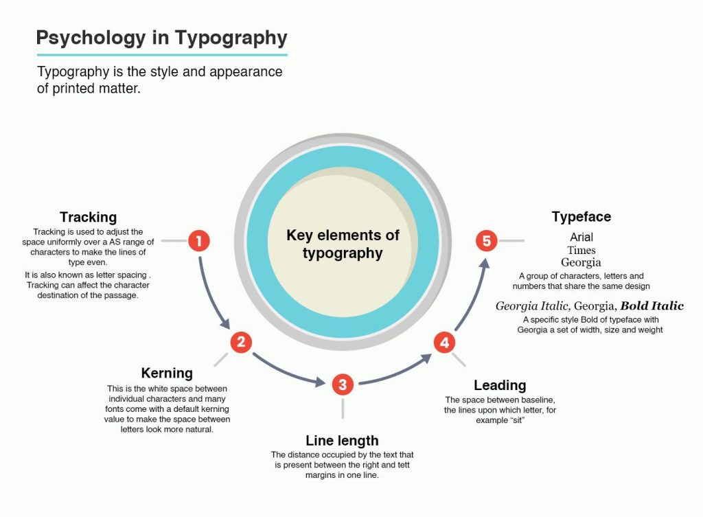
When it comes to alignment, kernings, leadings, size, and style of the font, there's so much to take into consideration. The best advice regarding typography would be to make it simple, clear, and user-friendly. If it takes a long time to make what you're trying to say, people will lose interest and look for something more effective.
This is where you have to understand that typography has to be so efficient to make your target audience look past the text formatting and focus on reading. There are two more things to think about: high hopes regarding what your readers will read first on a page and the page layout.

The page layout plays one of the most vital roles in how people view your content. The same applies to the process of creating a logo. You can have the most durable logo of them all, but if the typography isn't complementing its design, you'll get the exact opposite effect of what you've tried to achieve.
A poor choice of typography usually results in a disaster rather than success, especially today, in the visual world. Let us put it this way: a poor choice in typography won't just look bad, but it will harm your brand identity and send a wrong message to your target audience that might interpret all that your brand stands for the wrong way.
Typography matters a whole lot, and it can complement what you want to say as a brand. With that in mind, here are excellent reasons why typography in graphic design is so important.
Use different font types and sizes to help your audience determine and visualize the points that are vital to your presentation. They need to be able to do this just by looking at it. If they can follow along with no problems, this will help them focus on your presentation and get to the point of what you're trying to say.

Typography should be easy to read, understand, and clean. Therefore, use fonts that your readers can easily relate to. This is key to any presentation. Avoid using fonts that are either cramped together or too small as you won't get the attention you need, and your presentation efforts will be in vain.
If you want the target audience not only to understand your project but to relate to it, you need to provide a presentation that is easy to comprehend, and typography can help you do that.
Use different font types and sizes to help your audience determine and visualize the points that are vital to your presentation. They need to be able to do this just by looking at it. If they can follow along with no problems, this will help them focus on your presentation and get to the point of what you're trying to say.
It's essential to be consistent when presenting anything. Creating balance through a presentation is the best way to make your audience understand the message you're trying to convey. This is where typography can help.
It unified every aspect of your presentation, creating harmony through simplicity and continuity. That's why it's recommended to use the same font in your presentation. This keeps your presentation uncluttered and synchronized but, more importantly, attention-grabbing rather than distracting.
In this visual world, people react best to visuals. So, if you want to make the most of your presentation, use the most memorable fonts. The font is the visual that your audience relates to most.
If you want them to recognize your brand among all others, you need visuals that build brand recognition. The font you use needs to be a form of typography your audience can identify with. Therefore, your typography is how you present your brand to the public. Keep it visually engaging but straightforward and memorable.
If you're creating a presentation about your website, you need to make sure that your viewer can easily understand what that website stands for and what sort of data it provides.
Regardless of a website being related to a product, service, or business, the typography in use will make it or break it. The arrangement of details, fonts, colors, and content is what will establish communication between you and the visitor.

If you choose the right typography for your presentation, you can change the way your audience reacts to what you're presenting. That's why typography matters in graphic design. Paying attention to specific details and being consistent with the use of a typeface is just as important as the use of images, colors, and graphics in graphic design.
Typography is a tool that you use to create, develop, and solidify your brand. The main point of your presentation is for your audience to take action. And, to do that, you need to attract them, grab their attention, convey your message, and evoke the right emotion that should be the push that makes them move the way you want them to.
Anticipating how typography elements like styling and fonts affect your audience is the only way to use typography effectively
We've done the design work, now let our read-made designs propel your presentations forward.
Take a look at PresenterMedia's PowerPoint templates that are pre-designed, animated and ready for download. Create your next epic presentation now!
© 2009-2021 Eclipse Digital Imaging, Inc.
Quality PowerPoint Templates, Animations, videos, and 3D Clipart.
PowerPoint® is a registered trademark
of Microsoft Corporation.