
12 Must-Know Presentation Design Tips for Non-Designers
So, you’ve been tasked with creating a presentation, but you’re not a designer? Don’t panic. Even if you’ve never touched Photoshop or color theory isn’t your jam, I’ve got you covered. With these simple, effective tips, you’ll be designing slides that make your audience go “Wow!” in no time. Let’s dive into the fun world of presentation design—no art degree required!
1. Structure First, Design Later (Yes, It’s That Easy)
Here’s the secret: the best-looking presentations start with good content structure. Before you even think about colors and fonts, map out your presentation. Think title slide, intro, main points, and conclusion.
Creating this skeleton first will save you from the dreaded “too much on one slide” syndrome. It’s like building a house—you wouldn’t start with the curtains, right?
2. Cut the Text (Your Audience Will Thank You)
Listen, no one wants to read War and Peace on a PowerPoint slide. Keep your text short and to the point. Think of your slides as backup singers to your star performance—they enhance what you're saying without stealing the spotlight.
Use bullet points, quick phrases, or even a single keyword if that works. Trust me, your audience will be glued to your words, not lost in paragraphs.
3. Pick Fonts That Don’t Require a Magnifying Glass
It’s tempting to get fancy with fonts, but let’s leave the wild calligraphy to wedding invites. Stick with clean, simple fonts like Arial or Calibri that people can read from the back of the room (or on tiny laptop screens).
Pro tip: never use more than two fonts in a presentation. Think of fonts like shoes—you want them to match, not compete for attention.
4. Master Visual Hierarchy (AKA, Make Important Stuff Look Important)
We humans are visual creatures, and we naturally gravitate toward bigger, bolder things. Use that to your advantage. Titles should pop with a bigger font, while your main points can be a little smaller.
Want your audience to focus on something specific? Bold it or make it a bright color. It’s like giving your audience a treasure map where the gold is your key takeaway.
5. Use High-Quality Images (No Blurry Stock Photos, Please!)
Nothing says “I threw this together last minute” like a pixelated image. High-quality visuals are your best friend when designing a presentation.
Sites like PresenterMedia.com offer gorgeous, high-res images, animations, and videos that will make you look like you hired a professional designer. Just remember: the image should enhance your message, not confuse it. Don’t throw in a picture of a cat when you’re talking about sales figures (unless it’s a really great cat picture).
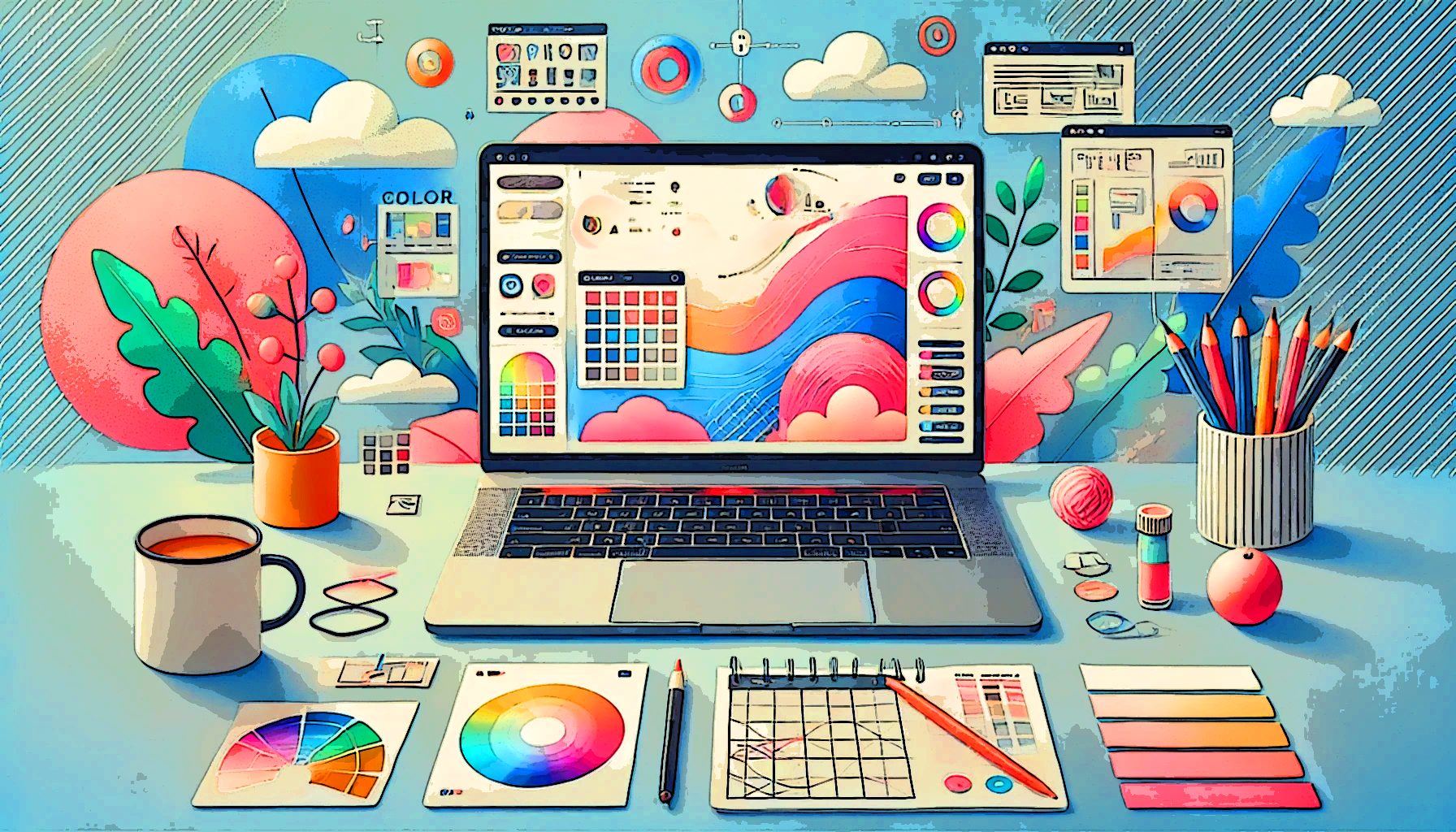
6. Stick to a Color Scheme (And No, It Doesn’t Have to Be Boring)

Picking colors isn’t rocket science, but it can be intimidating. Start with one main color and a couple of complementary ones. If you’re unsure about your color palette, tools like Adobe Color or Canva’s color generator can help you find combinations that won’t hurt your eyes.
Oh, and make sure there’s enough contrast between your text and background—no one wants to squint their way through your presentation.
7. Embrace White Space (It’s Your Best Friend)
Just because you can fill up a slide with text and images doesn’t mean you should. White space, or empty space, makes your slides look clean and professional. It gives your content room to breathe.
Think of it like leaving space on your dinner plate—you wouldn’t want everything to blend into a mushy pile. White space is the garnish that makes everything look more appetizing.
8. Keep Animations Chill (No Need for a Fireworks Show)
Animations are like salt: a little goes a long way. Sure, flying text and bouncing icons look cool the first time, but overdo it and your audience will feel like they’re watching a 90s screensaver.
Stick to simple, classy transitions like fades or slides, and save the fancy stuff for when it actually adds value (like revealing key points gradually). Less is more, my friend.
9. Show, Don’t Tell with Data Visualizations
We all know data can be a snoozefest if presented wrong. Instead of a wall of numbers, turn your data into charts, graphs, or infographics. This instantly makes your stats more digestible and visually appealing.
Plus, everyone loves a good pie chart. Just remember, your visuals should make your point clearer, not more confusing. Simple, colorful graphs are your new best friends.
10. Consistency is Key (No Wardrobe Changes for Your Slides)
Imagine if every slide in your presentation looked like it came from a different universe. It’s not just confusing—it’s visually jarring. Stick with a consistent style throughout your slides: same font, same color palette, same layout structure.
Using a template from PresenterMedia.com is an easy way to ensure your slides don’t feel like they’re all over the place. Your audience will thank you for keeping things visually consistent.
11. Add Icons and Shapes (But Don’t Overdo It)
Icons and shapes can add a little extra flair to your presentation without overwhelming the audience. They’re like the seasoning to your design dish. Just remember: use them sparingly.
Icons from PresenterMedia can help you make a point quickly without bogging your slide down with too much text. And hey, who doesn’t love a well-placed thumbs-up icon?
12. Proofread Like a Pro
There’s nothing worse than spotting a typo mid-presentation. (Is it too late to fix it? Yes. Is everyone staring at it? Also yes.) Before you hit “Present,” do a quick proofread for grammar, spelling, and clarity.
Then, run through your slides to make sure everything looks good on the big screen. You want your presentation to scream “polished” and “professional,” not “last-minute scramble.”
Advice on Choosing Visuals and Maintaining Consistency
Let’s face it: visuals can make or break your presentation. Choose wisely, and you’ll keep your audience engaged. Here’s how:
-
Pick Visuals That Make Sense
When selecting visuals, make sure they actually support your content. Throwing in a random picture because it “looks cool” isn’t going to cut it. Choose images, charts, or icons that reinforce your message and make it easier to understand. And yes, the right cat meme can be relevant, but only if you’re talking about something, well, cat-related. -
Consistency is Your Visual Wingman
Think of consistency as the glue that holds your slides together. Stick with the same font, colors, and visual style throughout the presentation. If you’re using icons, pick ones that share the same design aesthetic. This way, your slides will flow together, and your audience won’t be distracted by sudden design changes. A well-coordinated presentation is like a well-coordinated outfit—it just feels right. -
Don’t Clutter Your Slides
We get it—you want to show off all the cool visuals. But less is often more. Give your slides breathing room. Too many images, icons, or blocks of text can overwhelm your audience and dilute your message. A clean, uncluttered slide with one or two impactful visuals will always win over a chaotic, crowded one. Keep it simple, and let your main points shine!
So, Where Can You Get Great Content to Get Started?
Websites like PresenterMedia make you look like a pro presentation and graphic designer in minutes. Here are some powerful tools they offer.
- Ready-to-Go Templates: Say goodbye to the dreaded blank slide. Use pre-made PowerPoint templates and customize them to fit your needs.
- Video Templates: Quickly craft a unique video from a library of customizable video templates.
- Animated Clipart: Yes, animated. These little gems add fun and movement without being over the top.
- Video Backgrounds: Boring static slides are so last year. Spice things up with PresenterMedia’s dynamic video backgrounds.
- Infographic Templates: Need to visualize complex data? They’ve got customizable infographics for that.
- Audio Clips: Add some sound effects or background music to make your presentation stand out.
- WordCloud Maker: Input important words, choose a shape, and pick a color theme, and the app will build a unique word cloud for you.
- Calendar Maker: Select a calendar design template, pick with month and year, and swap out image placeholders for a stand-out calendar design.
- User-Friendly Interface: Even if tech isn’t your strong suit, PresenterMedia’s simple platform makes adding visual flair a breeze.
And there you have it! With these tips, you’ll be well on your way to creating presentations that are visually stunning, engaging, and—dare we say it—fun! Even if you’re not a designer, you can still knock it out of the park. Go forth and present with confidence!