Up to 50% OFF
What Can I Customize?
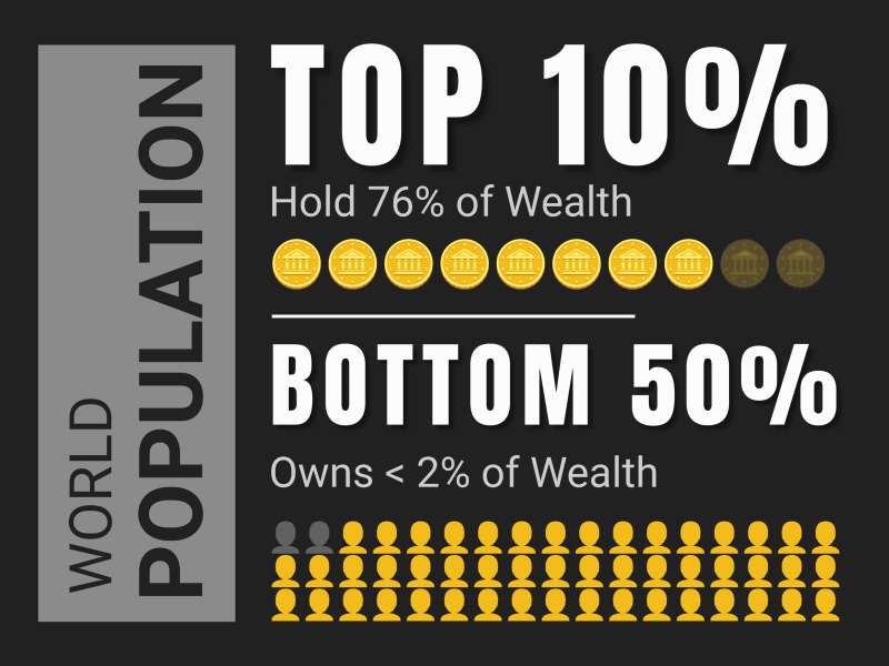
This editable pictograph displays two contrasting groups labeled 'TOP 10%' and 'BOTTOM 50%' against a dark background. The 'TOP 10%' section shows a stack of gold coins representing the wealth held by this group. The 'BOTTOM 50%' section has a much longer row of miniature yellow figures, indicating a more significant population holding significantly less wealth.
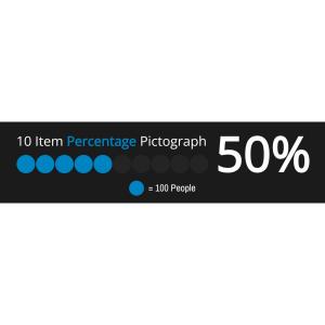
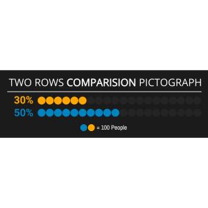
Hello! By clicking on 'Customize This Item' above, you can change text, add an image, delete elements, or access the pictograph editor to change the icons, add or decrease icons, and change the layout. This feature allows you to tailor the pictograph to better fit your needs and presentation style.
This pictograph starkly visualizes the concept of world wealth distribution, highlighting the disparity between the rich and the poor. It is a powerful tool for conveying complex economic data in an easily understandable format, emphasizing the concentration of wealth within a small fraction of the population.
This image represents significant economic and financial concepts such as income inequality, wealth distribution, and societal stratification. By illustrating that the top ten percent hold a majority of wealth while the bottom fifty percent own less than two percent, it underscores systemic disparities. This visualization can spark discussions on fiscal policy, social welfare programs, and tax reforms to address these imbalances. It also serves as an educational tool to raise awareness about economic realities in various societies worldwide.
Adding this clipart image to a slide in one of our PowerPoint templates can create a visual focal point to accompany the presentation slide message. It helps to break down complex information into a more digestible format. This can enhance audience engagement and retention of the presented data.
The transparent PNG background of this image makes it highly versatile for media design projects. It allows designers to overlay this graphic onto various backgrounds without any clashing colors or borders. To remove or change the background visibility, one clicks on the visibility icon next to the background layer in their design software's layers tab – enhancing adaptability for multiple design scenarios.
You can find many more standout Pictographs for visual aids. These can be used to enhance your presentations and make your data more visually appealing. Explore our collection to find the perfect pictograph for your next project.
pictograph wealth distribution global disparity economic data rich-poor wealth
Similar Templates and Designs
© 2009-2021 Eclipse Digital Imaging, Inc.
Quality PowerPoint Templates, Animations, videos, and 3D Clipart.
PowerPoint® is a registered trademark
of Microsoft Corporation.