Up to 50% OFF
What Can I Customize?
Customizable clipart lets you modify colors, text, and design elements right in your browser to create graphics tailored to your message and style. It’s perfect for presentations, handouts, websites, and more.
Click the green 'Customize this Item' button above. Then, in the online editor, click the design and select Edit to change text labels, swap colors, reposition elements, and add a logo before downloading. When finished customizing, click Build and Download.
After customizing, download your clipart and insert it into PowerPoint or Google Slides, or upload it into video projects using SlideClips Video Maker. The clipart works in any program that accepts PNG images.
A limited selection is available for free. Full access to all designs and customization features requires a PresenterMedia Unlimited Plan Subscription. Go to the Customizable Clipart page to see all free customizable clipart indicated by the green arrow located in the top right of every preview thumbnail.
Customizable clipart lets you add your own branding, colors, or personal style, making your presentations stand out and feel uniquely yours. It saves time while still giving you creative freedom, helping you connect with your audience in a professional and memorable way.
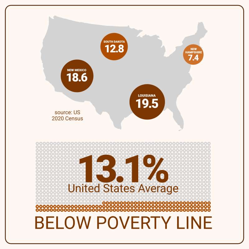
The editable pictograph displays a map of the United States with three highlighted circles indicating different percentages. The largest circle is located over Louisiana and reads "19.5," while two smaller circles, "12.8" and "7.4," respectively, are located in other regions of the map.
This poverty line pictograph conceptually represents the varying poverty levels across different states within the United States. The differing sizes of the circles likely correlate to the proportion of individuals living below the poverty line, with larger circles indicating higher percentages.
To tailor this graphic to your needs, click the 'Customize This Item' above. You'll have options to change text, add images, delete elements, or fully access the pictograph editor, where you can alter icons, adjust their quantity up or down, and modify layout designs according to your preferences.
The image conveys critical information regarding financial disparities and poverty concentration in specific areas. A large number, "13.1," is prominently displayed at the bottom, suggesting this might be an average or a significant figure related to national poverty statistics. The term "BELOW POVERTY LINE" is emphasized beneath this number, reinforcing the focus on specific populations' economic hardship. This visual representation can effectively communicate complex data in a simple and impactful manner, making it easier for viewers to understand and engage with financial and socioeconomic issues.
This image represents the stark financial disparities that exist within the United States. The varying sizes of the circles highlight the uneven distribution of poverty, with some states experiencing significantly higher rates than others. The prominent "13.1" figure at the bottom likely serves as a national average, providing a benchmark for understanding the overall poverty landscape. By visually depicting these statistics, the pictograph makes it easier to grasp the severity and distribution of poverty, which can be crucial for policy-making and social awareness. The emphasis on "BELOW POVERTY LINE" underscores the urgency of addressing these economic challenges. Overall, this image serves as a powerful tool for illustrating the financial struggles faced by many Americans.
Adding this clipart image to a slide in one of our PowerPoint templates can create a visual focal point to accompany the presentation slide message. It helps to break down complex data into easily digestible visuals, making your presentation more engaging. This can be particularly effective when discussing socioeconomic issues or financial statistics.
This image's transparent PNG background makes it highly versatile for media design projects. It allows for seamless integration into various layouts without conflicting backgrounds. By clicking on the background layer's visibility in the layers tab, designers can easily remove or reinstate it as needed for their specific project requirements.
You can find many more standout Pictographs for visual aids. These can enhance your presentations by providing clear and impactful data visualization. They can also significantly improve audience understanding and engagement, whether for educational purposes or professional presentations.
pictograph poverty line pictograph U.S. states economic disparity
Similar Templates and Designs
© 2009-2025 Eclipse Digital Imaging, Inc.
Quality PowerPoint Templates, Animations, videos, and 3D Clipart.
PowerPoint® is a registered trademark
of Microsoft Corporation.