Up to 50% OFF
What Can I Customize?
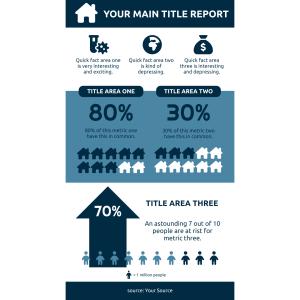
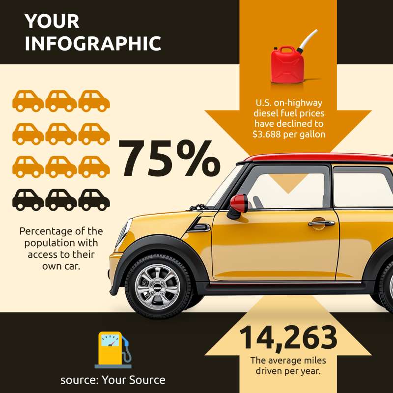
This editable pictograph features a large, bold title, "YOUR INFOGRAPHIC," at the top, set against a vibrant yellow background. Below the title is a row of car icons with one highlighted in red, followed by a prominent percentage figure, "75%," indicating a statistic related to automobiles.
By clicking the Customize This Item button above, you can change text, add an image, delete elements, or access the pictograph editor to change the icons, add or decrease icons, and change the layout. This flexibility allows you to tailor the pictograph to fit your needs, making it a powerful tool for personalized presentations and reports.
This infographic includes additional data points such as U.S. on-highway diesel fuel prices averaging $3.688 per gallon and an annual average of 14,263 miles driven annually by individuals. Corresponding icons accompany these figures—a fuel can and an odometer—enhancing the visual appeal and comprehension of the data presented.
This graphic serves as a visual representation of automobile-related statistics that could reflect vehicle ownership and usage trends. Iconography simplifies complex data into digestible visuals, making it easier for viewers to grasp key information at a glance. The highlighted car icon suggests a significant portion of the population has access to personal transportation, while the fuel price indicates economic factors affecting drivers. Overall, this infographic encapsulates critical aspects of modern vehicular mobility within society.
The image represents various facets of travel and commuting through its use of symbols and statistics pertinent to automobile usage. The "75%" figure likely signifies that three-quarters of the population have access to their car, which affects traffic patterns and urban planning. The noted decline in diesel prices could influence long-term travel decisions and freight costs. Furthermore, the average miles driven annually provide insight into commuting habits and environmental impact due to emissions from extensive vehicle use. This infographic can help urban planners and policymakers understand the current state of automobile dependency and its effects on infrastructure and the environment. It also highlights the need for sustainable transportation solutions to reduce the carbon footprint associated with high vehicle usage. By presenting this data visually, the infographic makes it easier to communicate these complex issues to a broader audience.
Adding this clipart image to a slide in one of our PowerPoint templates can create a visual focal point to accompany the presentation slide message. It helps to break down complex data into easily digestible visuals, making your presentation more engaging. This can be particularly useful in educational settings where visual aids enhance understanding.
The transparent PNG background feature makes this image versatile for various media design projects where it can seamlessly integrate with other elements without any background clashes. By clicking the visibility of the background layer in the layers tab; designers can easily remove or reinstate the background according to their project needs—making it ideal for creating clean-looking educational materials or digital content.
You can find many more standout Pictographs for visual aids. These pictographs are designed to make your data presentations more impactful and visually appealing. Explore our collection to find the perfect visual aid for your next project.
infographic pictographic fuel prices mileage data comprehension diesel
Similar Templates and Designs
© 2009-2021 Eclipse Digital Imaging, Inc.
Quality PowerPoint Templates, Animations, videos, and 3D Clipart.
PowerPoint® is a registered trademark
of Microsoft Corporation.