10 Tips for better preparing a PowerPoint presentation
What's one thing every presentation has in common? Their creators always wish they could make them better at getting their point across.
Whether you’re an experienced presenter or about to face an audience for the first time, you should find something helpful in these ten tips for better preparing a PowerPoint presentation.
💡 Need a head start on design? Explore our PowerPoint templates to find professionally designed slides for your next presentation.
1. Focus on Your Audience
Your audience is there to learn and needs to know that information revealed during the presentation will be helpful or profitable.
As you develop the presentation, keep your focus on why your audience has decided to listen to what you have to say.
Don’t guess what your audience wants to hear. You can find out specifics by sending out short questionnaires to a few people who will be there on the day.
2. Stick to the Core Message
While creating your presentation, always keep in mind the key message you are trying to deliver.
You don’t want your audience’s attention to wander, so each point should be brief. If what you are planning to say doesn’t contribute to the core message, leave it out of the presentation.
3. Keep Your Slides Clear, Simple, and Uncluttered
A slide with a lot of text will be like turning a switch off as far as keeping your audience engaged. Whether your meeting is online or in front of an audience, short slides that are to the point will always win the day.
Slides are brief reminders about the subject matter, and should only contain the key points. Minimalist designs will always do better at keeping the audience’s attention than text-heavy templates with complex graphics.
4. Use Professional Templates
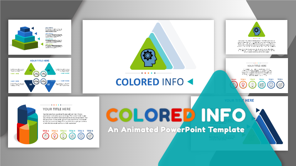
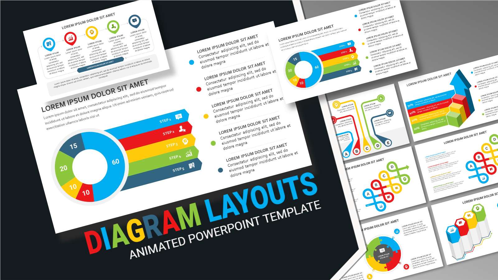
Animated PowerPoint Template Designs
Coming up with creative designs that won’t drown the message takes skill and experience. You may know a lot about your topic, but a poorly designed presentation won’t be very effective at delivering your expertise to the audience.
Fortunately, you don’t have to spend hours coming up with presentation designs because templates can help you create professional-looking slides in a matter of minutes rather than hours.
There are templates created to suit a wide range of industries, so whether you are speaking on business and finance, or wildlife and nature, there is a template that will perfectly complement your message.
Professional presentation templates from PresenterMedia give you the freedom to focus on your message rather than struggle with the finer points of slide design.
5. Enhance Your Message With Attractive Visuals
Your audience will be more responsive to visual information than a slide full of text.
Use attractive but relevant visuals to drive your point home. Your audience will be more likely to remember what they have seen rather than what they have heard or read.
As with templates, you don’t have to create your visuals from scratch. Online resources can provide every image you need to make your message stand out.
Charts and diagrams are an excellent way to liven up otherwise dull facts, figures, and statistics. Modern presentation software allows you to display this type of information in engaging ways that will deliver them with the impact they deserve. Animate the images for even greater engagement.
6. Use the 10-20-30 Rule
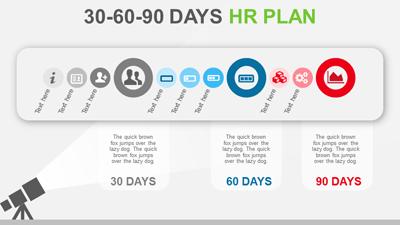
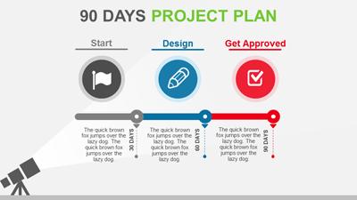
Guy Kawasaki from Apple is well known for this rule about creating presentations that won’t lead the audience to distraction. In short, the law says to create a presentation that:
- Contains no more than ten slides
- Is 20-minutes or less
- Use a font size of 30 points
The last rule deserves more explanation. Not only does a large font size create text that is easy to read, even for people at the back of the room, but it also helps you keep the textual information brief and to the point.
The 10-20-30 rule could be interpreted as less is more. But, what if you have more to say?
You should still keep your presentation simple, but if you’ve got more information to deliver, include it in a handout for after the presentation.
7. Tell a Story
Humans have been telling stories with pictures since the Palaeolithic age. You could say responding favorably to a powerfully delivered presentation is ingrained in our DNA.
A story helps you deliver your points in engaging and exciting ways to which your audience can relate. Each point will be more memorable when there is a relatable narrative attached to it.
8. Make Eye Contact
Great presenters make eye contact with their audience. There’s a lot of psychology behind why eye contact is such an essential part of a presentation.
Eye contact suggests sincerity and is a way of establishing trust and a genuine connection with the audience. It also states that you are comfortable with what you are saying and know it to be true.
This trait can be very persuasive if you’re trying to inspire your audience into following through with a call-to-action at the end of the presentation.
Eye contact is so vital that you should avoid giving your presentation in a darkened room unless it’s a small gathering. You, as the presenter, need to be visible and present as well. And don’t forget to smile.
9. Be Confident
The audience will pick up on a nervous presenter, and while most will be understanding, it can still take the wind out of your delivery.
Like eye contact, confidence will help you forge a greater connection with your audience. Confidence also helps your passion for the subject matter to shine through.
Confidence will show in your body language, so move around, be dynamic, and use open, confident gestures to drive the point home.
10. Research
Your years of experience can carry you a long way, but diligently researching the facts and figures you will be presenting will be reassuring for your audience.
Even expert knowledge goes out of date on occasion, so you want to make sure every fact you present is relevant to today’s world.
It’s a good bet that there will be questions asked after the presentation, so the more you have researched, the more knowledgeable you will appear.
Conclusion
Becoming a great presenter takes practice, but if you can learn to enjoy yourself during your presentations, your audience will respond in kind.
Remember, these ten tips will help shape your presentations for maximum impact and engagement. Your message remains a top key element with the most significant impact on your audience, but adding attractive and engaging graphics will help visually bring your message to life. Implement these presentation tips, explore PresenterMedia's visual designs, and give your audience a better presentation.
Happy Presenting!








Blog Comments (Sign In to Comment):