Create a compelling info-graphic in PowerPoint
If your like me, all the graphs and charts start to look the same. They all blur into one giant chart with an overwhelming amounts of data. Wouldn't it be better if you could create a simple and visually compelling way to represent your data? Your audience will appreciate you for it.
For example take this graph on increasing home values from 1980 to 2000.
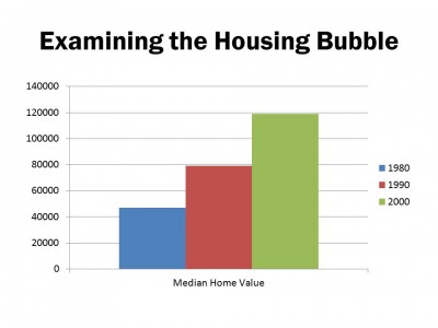
Pretty boring right? You've seen this a million times and it could just as well be a graphic on how board your audience is getting with each generic graph in your presentation.
But there is hope! Enter the info-graphic.
Instead of relying on a pre-generated graph to display your data, building a compelling info-graphic will tell the story in a much more pleasing an memorable way. And best of all, it's easy to do and you don't need to be a graphic designer. I simply used two elements from the PresenterMedia library to create this interesting build. (A build is a method of presenting information in stages, instead of throwing it all out at once)
I used a simple red arrow and and a housing graphic created by one of my partners.



I quickly layered the graphics on top of each other and used a gradient fill on a white shape to obscure portions of the red arrow until I was ready for my audience to see it. The end result was well worth the couple of extra minutes in took to create the build.
I hope this helps inspire you to create compelling visuals and info-graphics for your next presentation.
Good Presenting!
Art Holden


