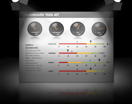
Have you ever wanted to use PowerPoint to demonstrate how your company is doing financially, production-wise, or any other measurable performance level? Last month one of our valued subscribers sent us a request to create a toolkit that could be used to show this information in a way other than a standard "pie chart" , "bar chart" or spreadsheet. The resulting toolkit is the Dashboard Toolkit Template as seen below in these few previews of the slides included with this template.
Today we are taking a look at one of our newest templates: The Dashboard Toolkit. What makes this toolkit so impressive is its functionality and ability to be customized to suit your needs.
Simply select the gauge that suits your needs, edit the data, including the numbers, size of the parameters, color selections etc. and save the presentation.
If the circular gauge does not suit your needs, take a look at the Data Driven Adjustable Linear Graphs. These graphs can have the values changed and will automatically adjust the size of each piece of the "bar" to reflect accordingly. Use this style to compare costs, averages, competition and more.
Thanks to Art, the creator of this template for all his hard work, as well as the suggestions from our subscribers which led to the creation of the Dashboard Toolkit. Keep sending us great suggestions and we'll keep creating new content!
© 2009-2021 Eclipse Digital Imaging, Inc.
Quality PowerPoint Templates, Animations, videos, and 3D Clipart.
PowerPoint® is a registered trademark
of Microsoft Corporation.