Up to 50% OFF
Sign up today and get instant
access to download our PowerPoint templates.
Yes! Our templates include built-in animations, such as slide transitions, motion graphics, and moving elements. These animations are fully editable in PowerPoint, so you can adjust or remove them based on your presentation needs.
All templates are fully editable in PowerPoint. You can change text, update colors, modify layouts, insert your own graphics, and apply branding to fit your presentation goals. This flexibility makes it easy to tailor any template to your audience.
Yes, most templates are compatible with Google Slides. You can upload the PPTX file to your Google Drive and open it to edit. However, some advanced animations and interactive features are only fully supported in PowerPoint.
Yes, our templates are designed to support both business and educational use. You'll find layouts for meetings, proposals, marketing, training, classroom lessons, and more—making them suitable for both professional and academic settings.
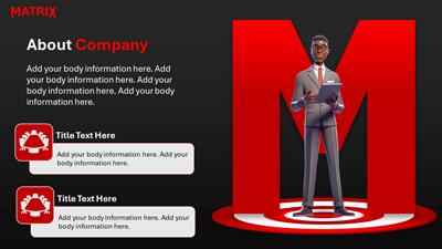
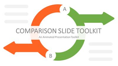
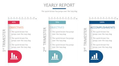
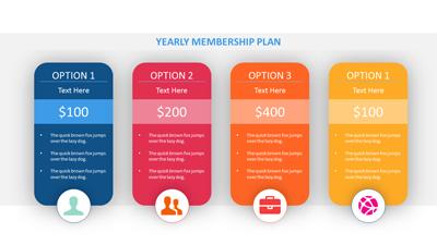
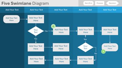
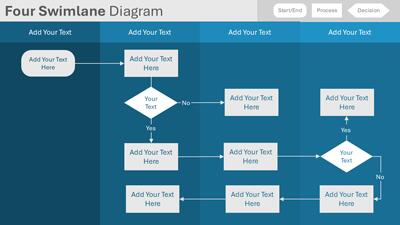
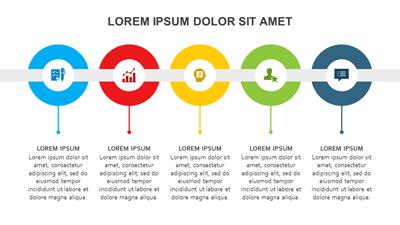
Yes, many templates include built-in layouts for timelines, flowcharts, comparison slides, data charts, and infographics. These slides are editable, allowing you to quickly present your ideas in a visual and engaging way.
New PowerPoint templates are added throughout the month to provide a steady stream of fresh content across business, education, seasonal, and trending topics. In addition to our regularly released designs, you can also use the AI Presentation Maker to generate a custom presentation at any time—complete with editable layouts and the option to apply any template theme.
Yes. A PresenterMedia subscription gives you unlimited access to our full library of PowerPoint templates. You can download and customize any template to suit your presentation needs—whether you're working on a business pitch, training deck, or lesson plan.
This PowerPoint template may be included in our free section. We offer a limited selection of PowerPoint templates for free so you can try them and see if they fit your design workflow. Visit the PowerPoint Templates page and find free PowerPoint templates marked with a green arrow in the top-right corner of each preview thumbnail.
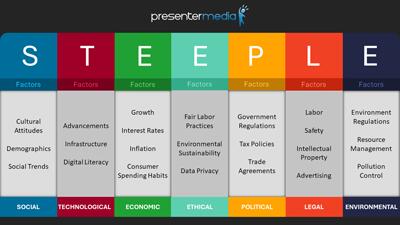
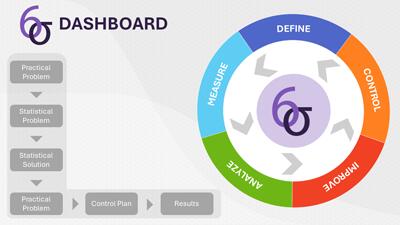
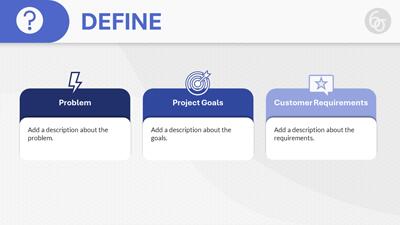
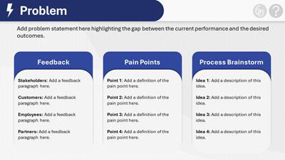
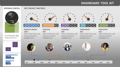
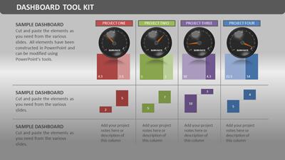
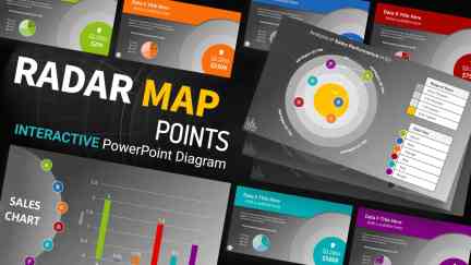
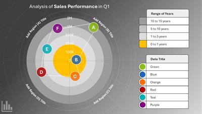
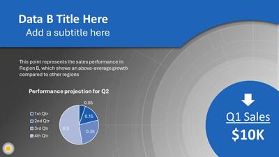
This Interactive Radar Chart PowerPoint template offers an engaging data display through an interactive radar chart diagram and related graphical representations. Each slide with vibrant colors and clear text placeholders ensures your presentation stands out. The template's versatile elements, such as color-coded legends, percentage indicators, and descriptive titles, make interpreting the data straightforward for any audience, giving you the flexibility to adapt to different presentation needs.
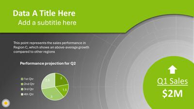
One standout feature of this Radar Chart PowerPoint diagram is its interactivity. Each data point on the radar chart corresponds to a specific slide. When presenting, click on a data point; the corresponding slide will provide additional context, explanations, or detailed breakdowns. For example, if a data point represents customer satisfaction, clicking on it reveals a slide with a comparison bar chart showing satisfaction levels across different demographics or periods.
This PowerPoint diagram set includes additional graphical elements like bar charts and circle graphics that complement the central radar chart. These supplementary visuals help provide a comprehensive view of the presented information. The design consistency across all slides ensures that your presentation maintains a professional look.
This PowerPoint template represents an innovative approach to data visualization within presentations. It allows presenters to convey intricate datasets in an understandable format while maintaining high engagement levels from the audience.
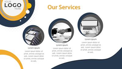
This versatile template can enhance presentations across various fields:
Editing the colors in this template is straightforward. At the end of the radar chart PowerPoint slides, you can find instructional slides to easily edit the colors to match your company colors or favorite color pallet.
Remember that effective data visualization enhances audience understanding and engagement. With the "Radar Chart Map" template, you can create impactful presentations that leave a lasting impression.
For more PowerPoint diagrams like this radar chart, explore our library of PowerPoint diagram templates.
diagram layout radar chart data analysis graph metrics comparative performance business professional
Similar Templates and Designs
© 2009-2025 Eclipse Digital Imaging, Inc.
Quality PowerPoint Templates, Animations, videos, and 3D Clipart.
PowerPoint® is a registered trademark
of Microsoft Corporation.